The BPC approached us to assist with their brand identity refresh, aiming to emphasize that fostering collaboration is more vital than ever in today's highly polarized political landscape. My role involved creating and refining templates for a variety of materials, ensuring they effectively conveyed the core message of bipartisanship, highlighting the significance of BPC's work.
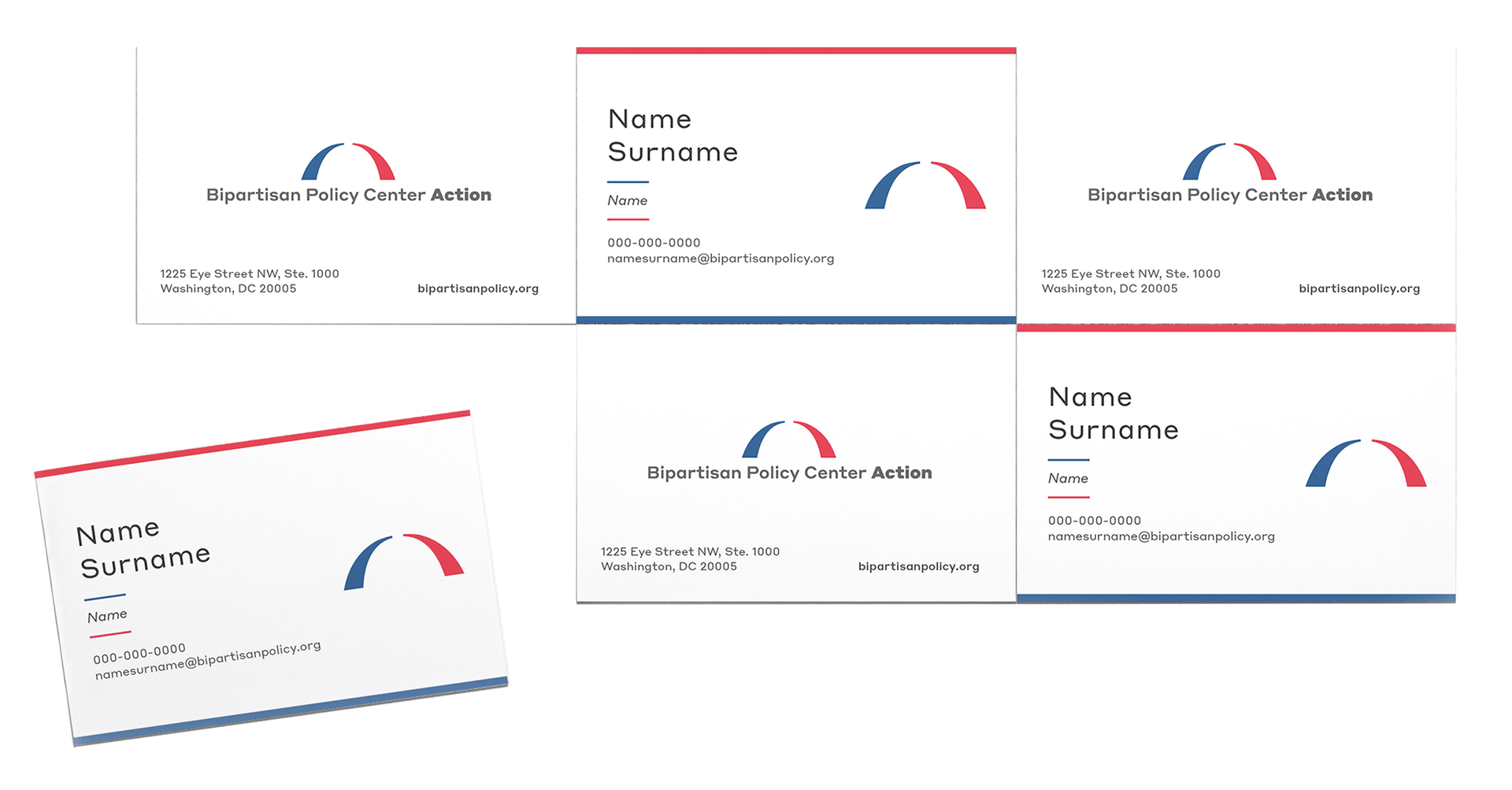
Two-Line Concept
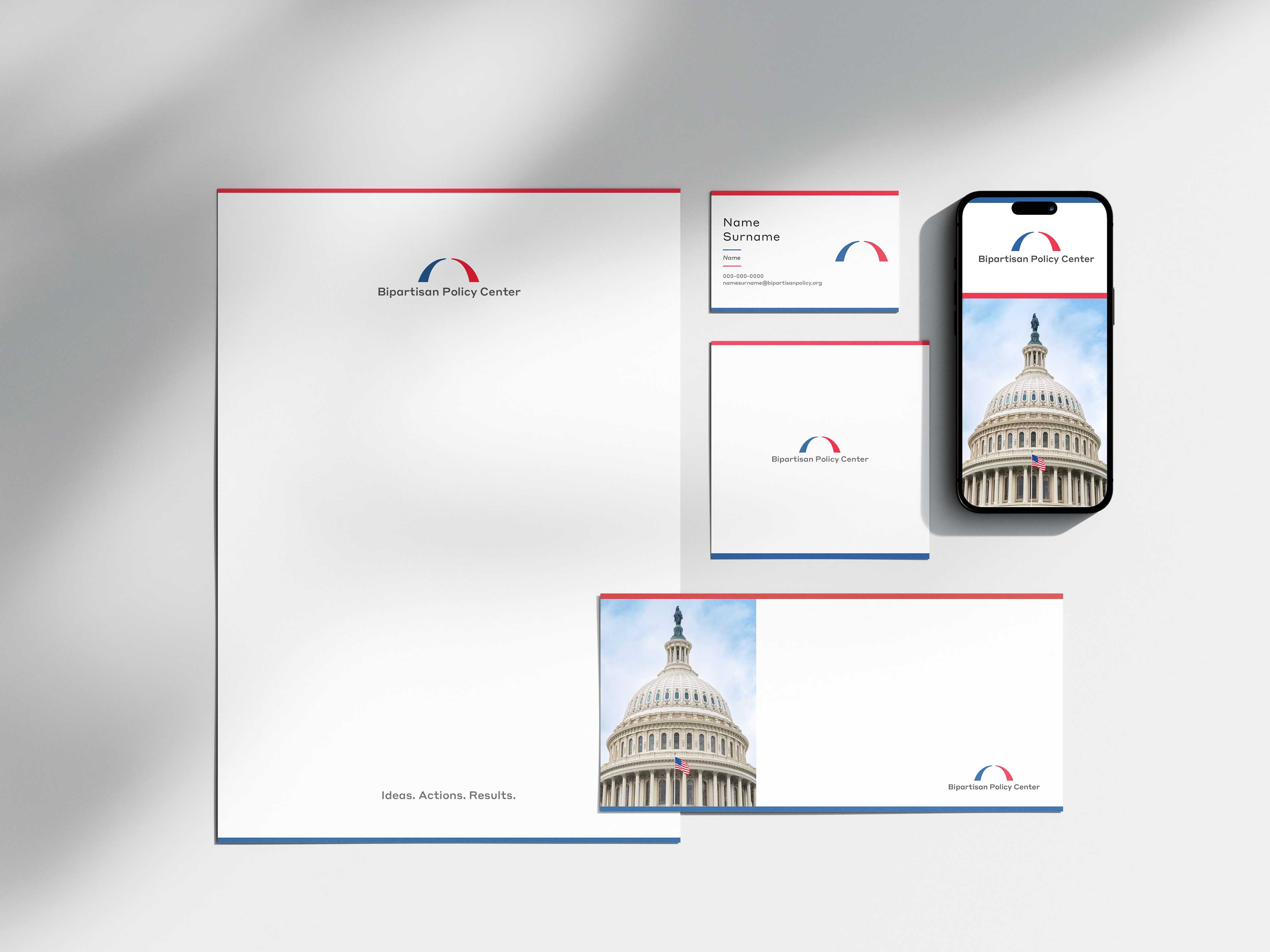
The initial product we refreshed, serving as a conceptual foundation for the layout refresh, was the business card. The two-line concept highlights the primary colors—red and blue—in equal importance, with lines crossing the top and bottom, against a clean background, resulting in a balanced, clean and impactful visual.
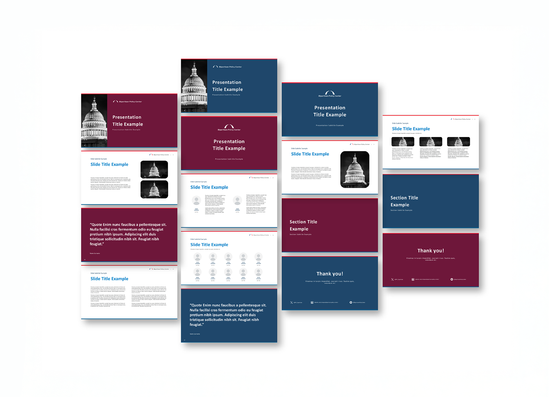
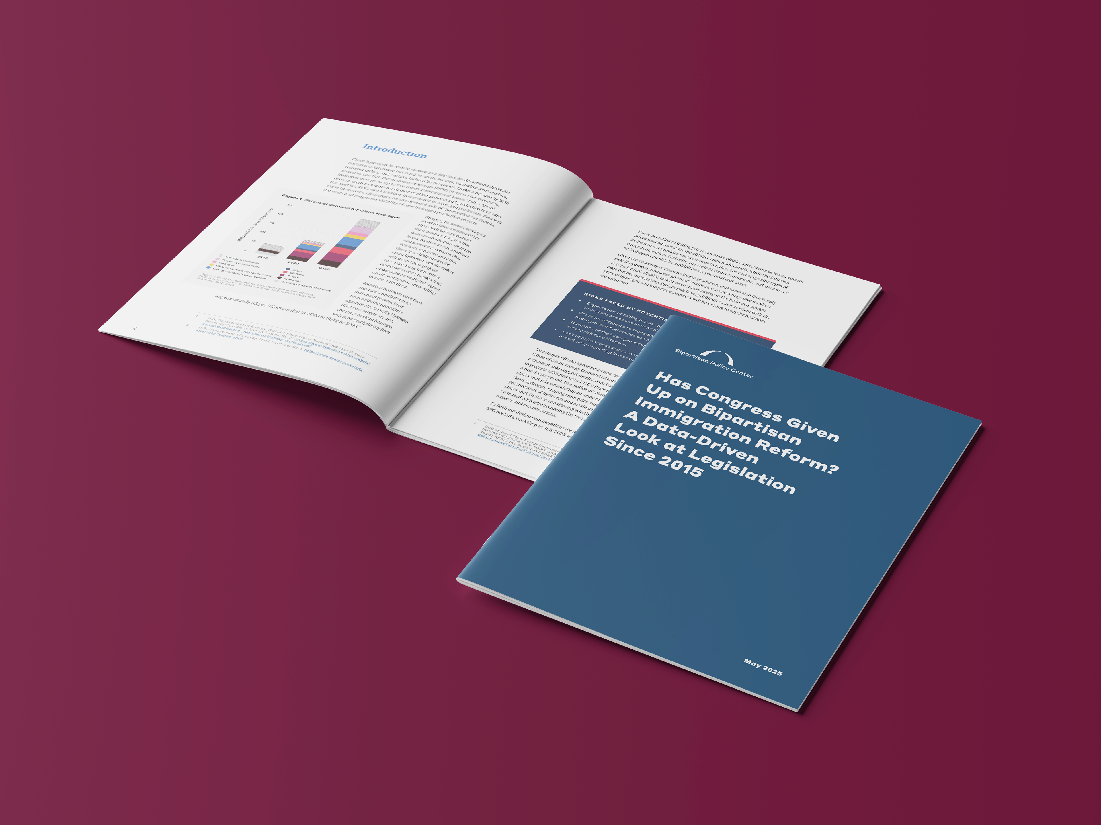
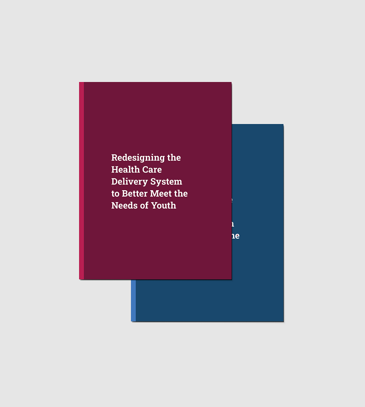
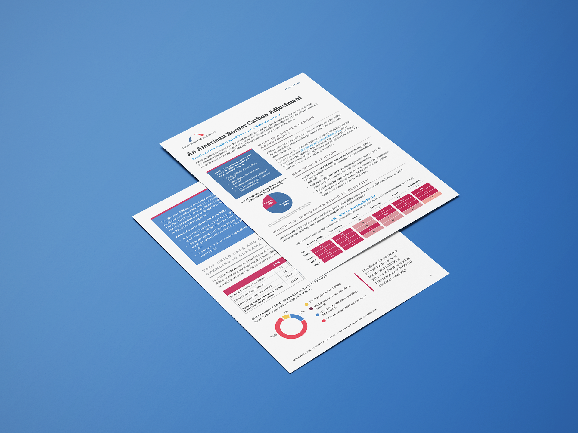
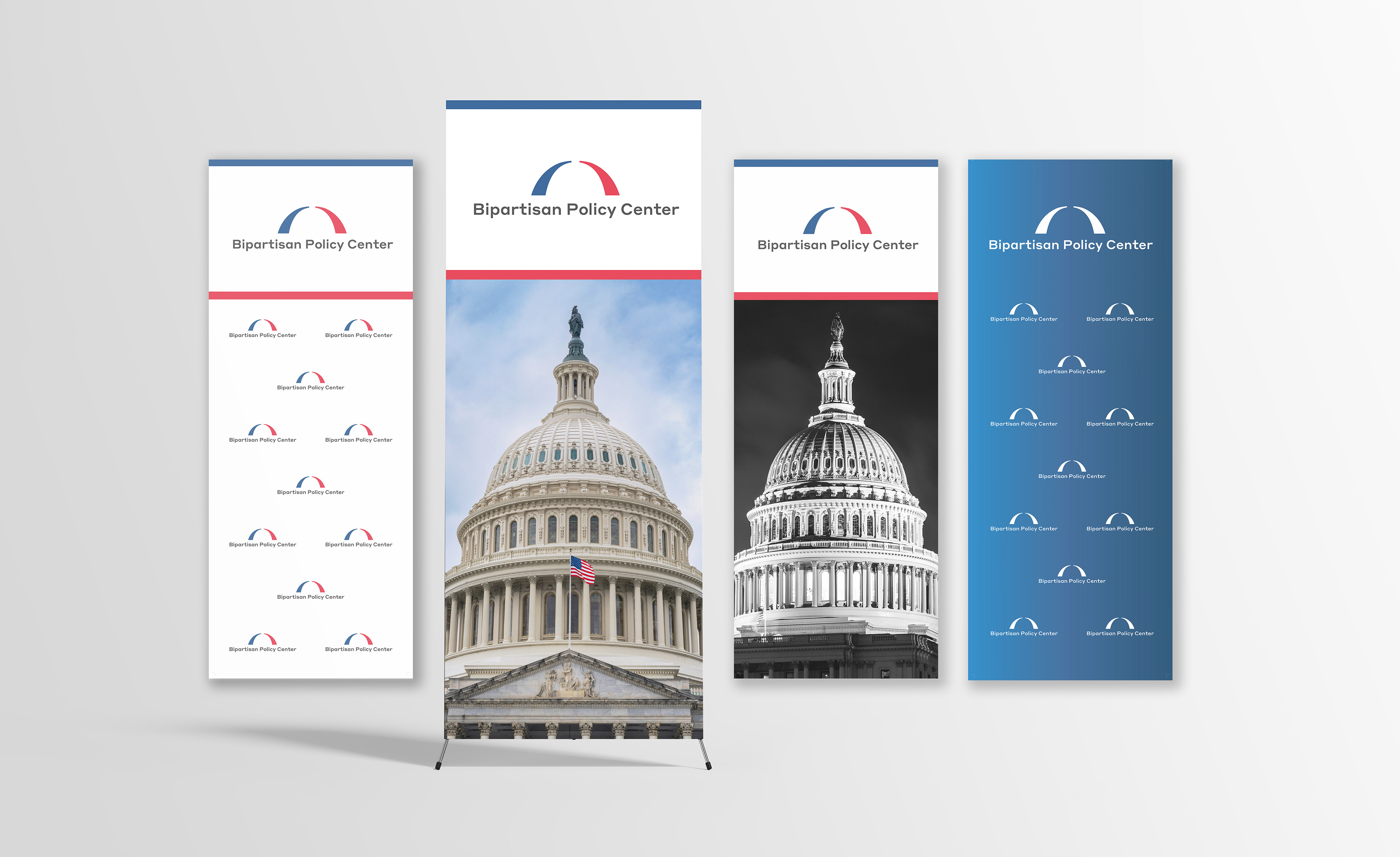
We subsequently adapted the two-line concepts across various stationary items, presentation templates (PPT), and event marketing materials. For the report design, which features a more vibrant color palette and graphic elements, these concepts were integrated as detailed elements within the report to maintain visual harmony and avoid clashing with its graphic-heavy design.