LOGO REFRESH
The logo refresh aimed to modernize the brand while maintaining its core identity, with an emphasis on improving functionality and usability.
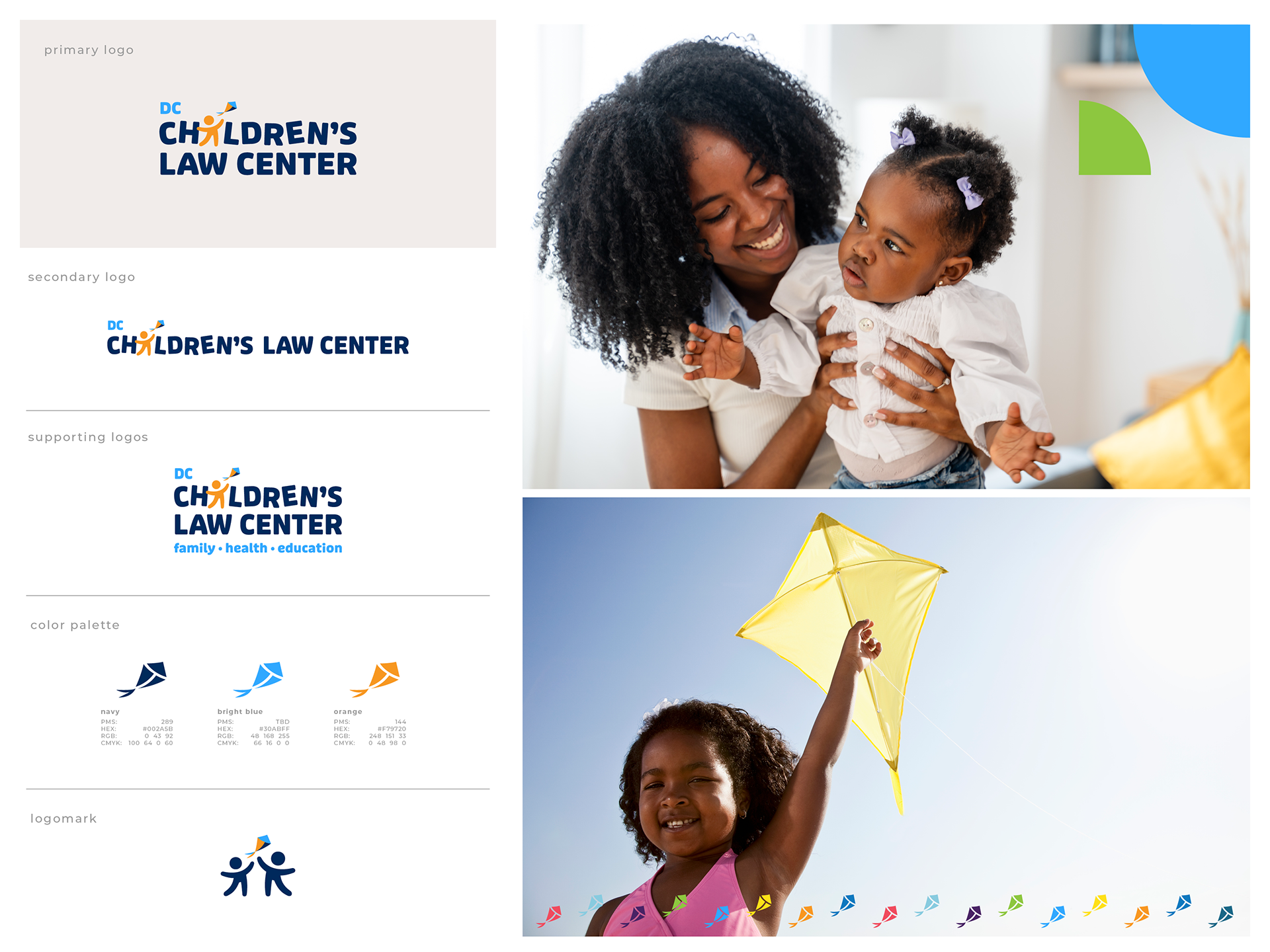
By preserving the iconic elements of the logo—the child and kite—and maintaining the playful arrangement of the letters, we preserved the identity of the logo. The navy color was introduced as the brand's primary color, and all elements were refreshed. The result is a logo that feels both fresh and familiar, perfectly balancing the fun universe of children and families, with the professionalism of the work that CLC does.
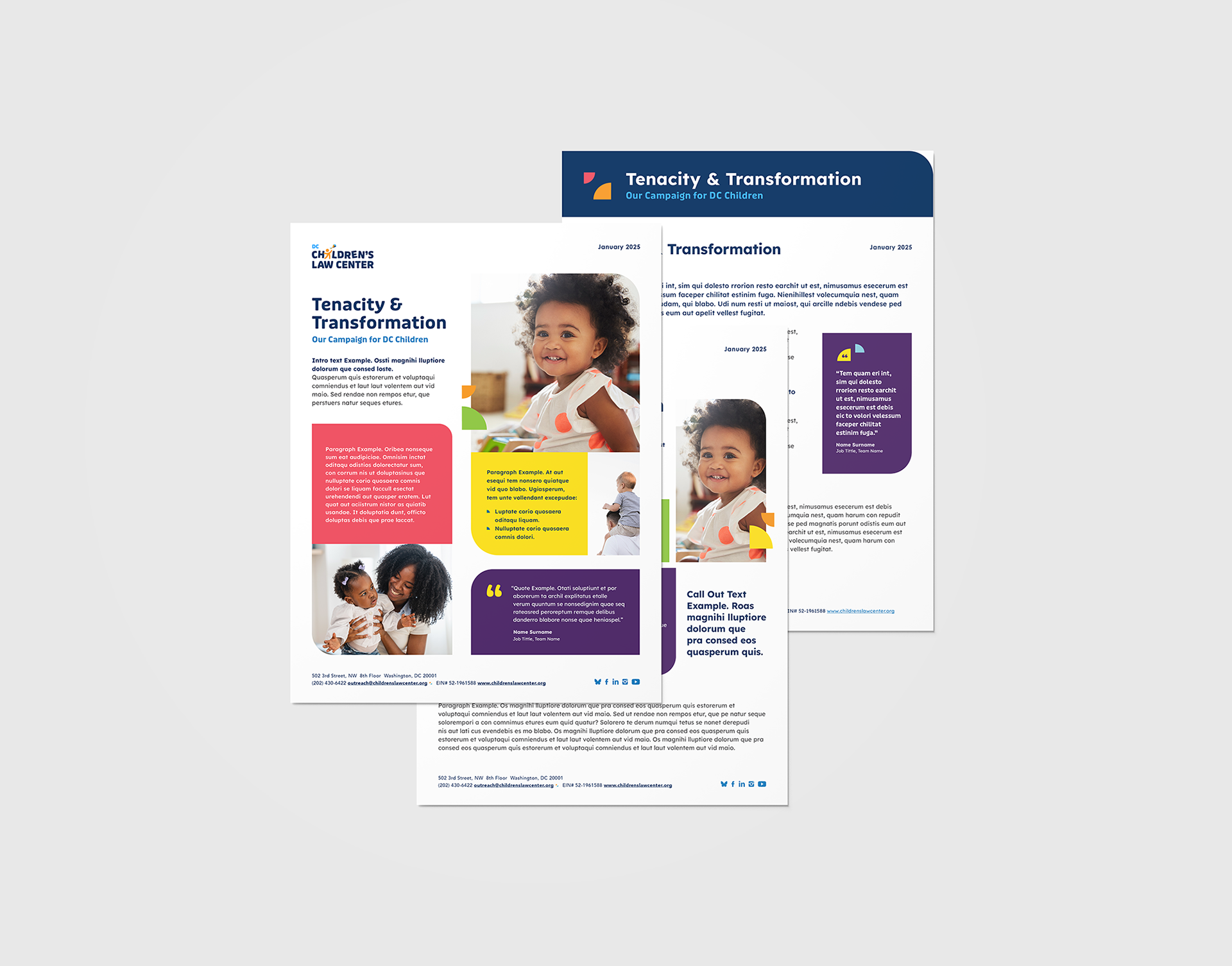
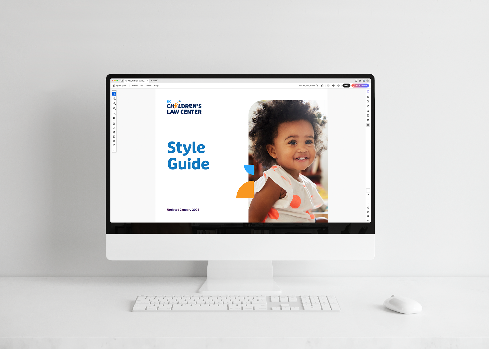
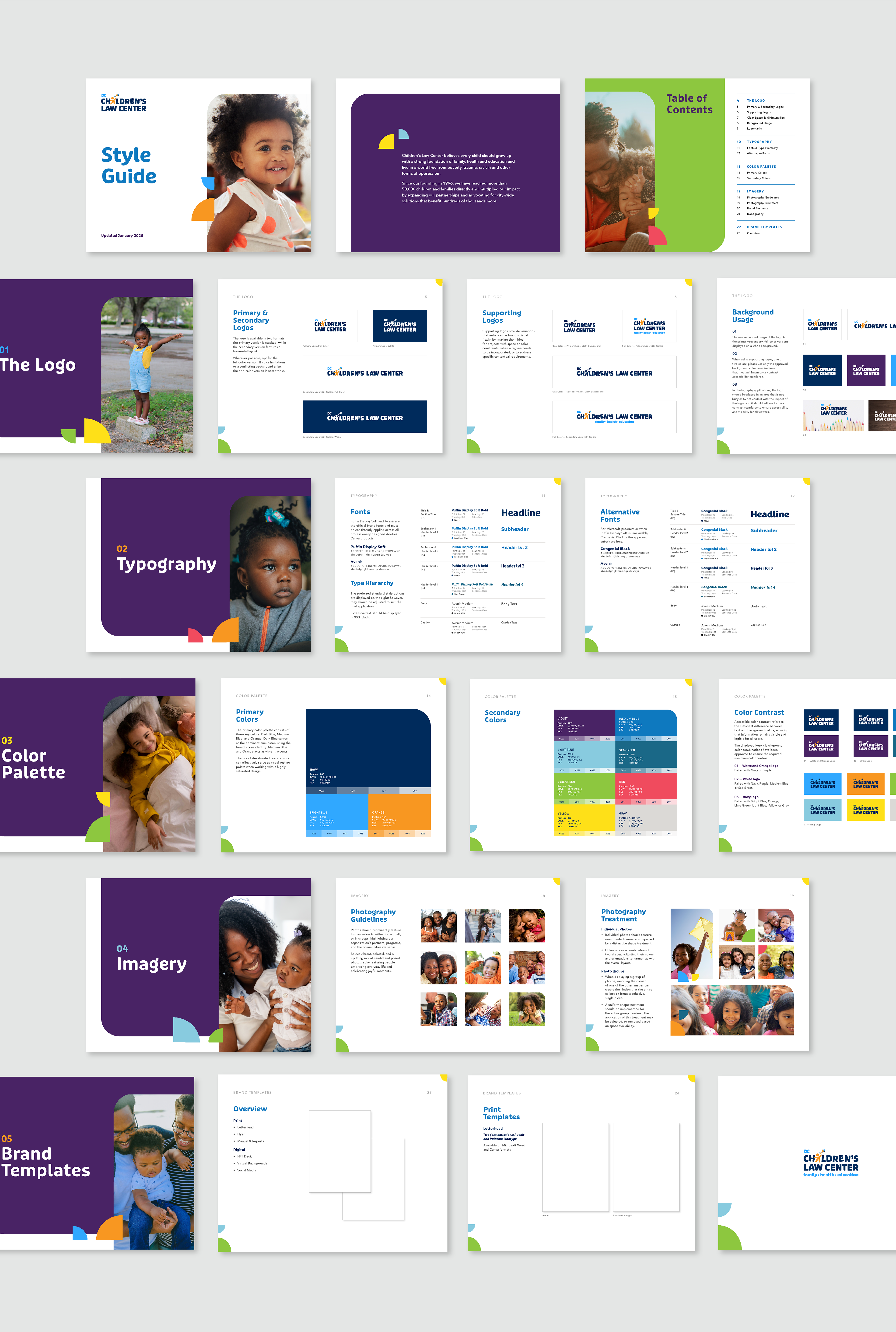
STYLE GUIDE
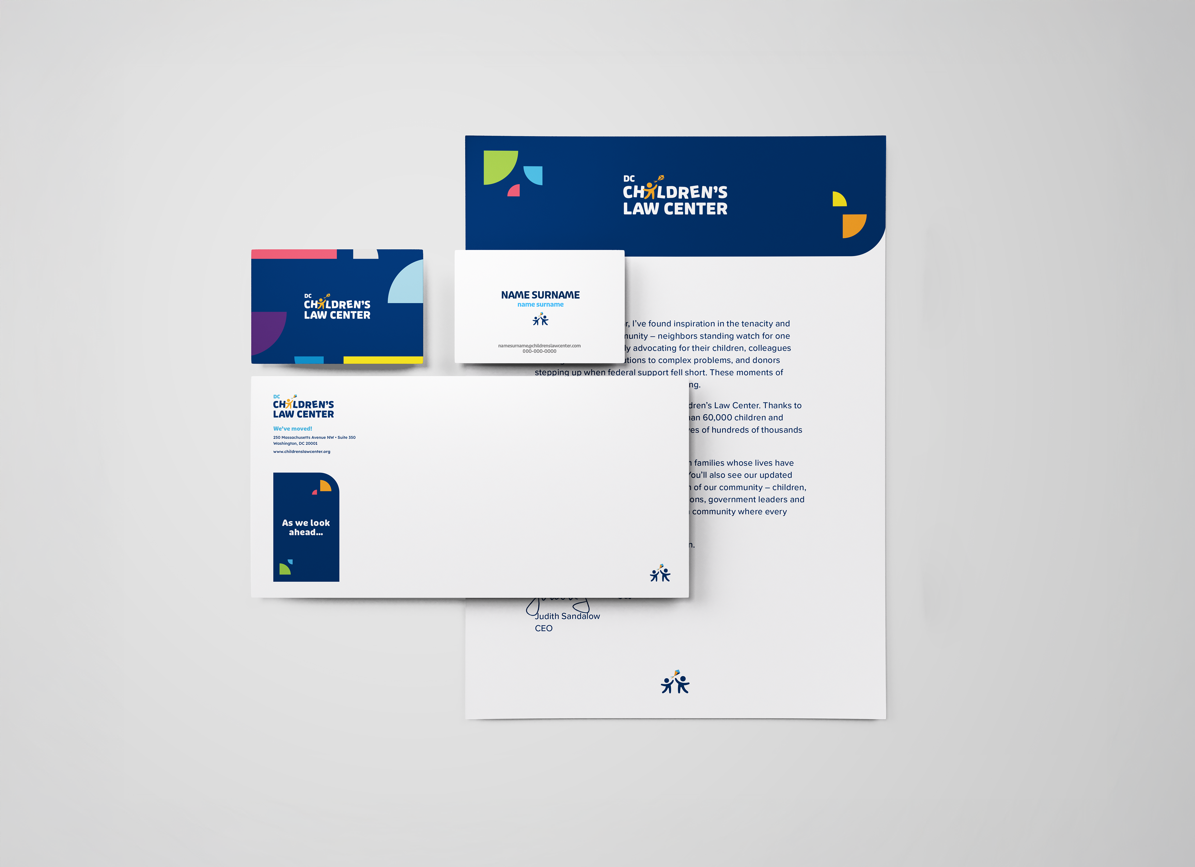
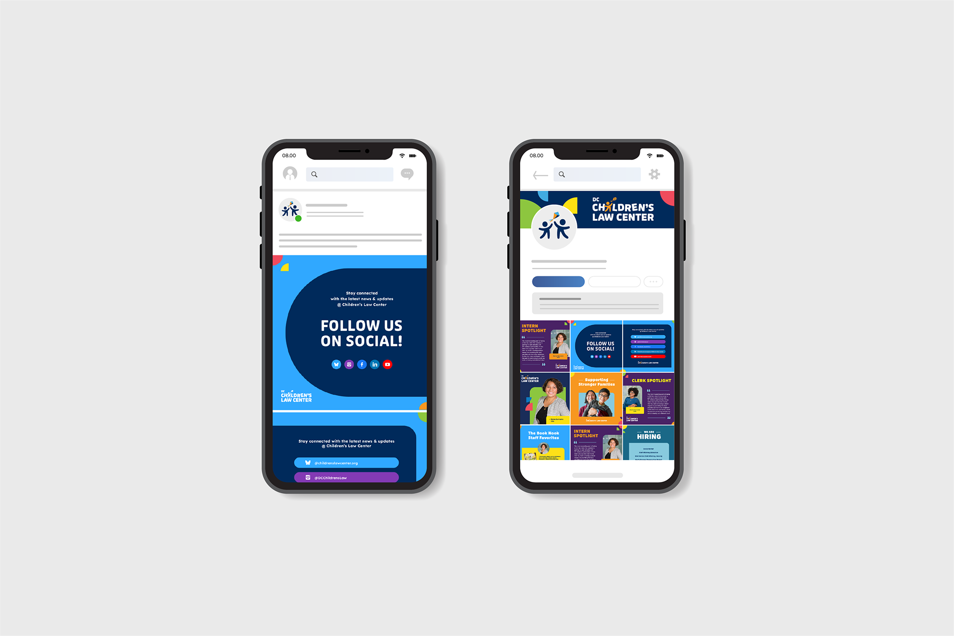
Resources were dispersed across multiple databases, making key information inaccessible to many employees and collaborators who needed it. To address this, the Style Guide was introduced as the primary resource for the CLC brand, ensuring consistency through clear, comprehensive guidelines for all visual and written content.
Available in both PDF and as a PowerPoint presentation, offering flexible, easily editable, and updatable formats to facilitate customization and updates.
PROJECT OVERVIEW
Client: DC Children's Law Center (CLC) // Fathom Creative
Project Manager: Heather Gregg
Art Director & Designer: Gabriela Venetucci
Scope: Phase I: Logo Refresh // Phase II: Style Guide Design